AI Systems
The Best Claude Code Skills for Frontend and UI Design in 2026
 6 min read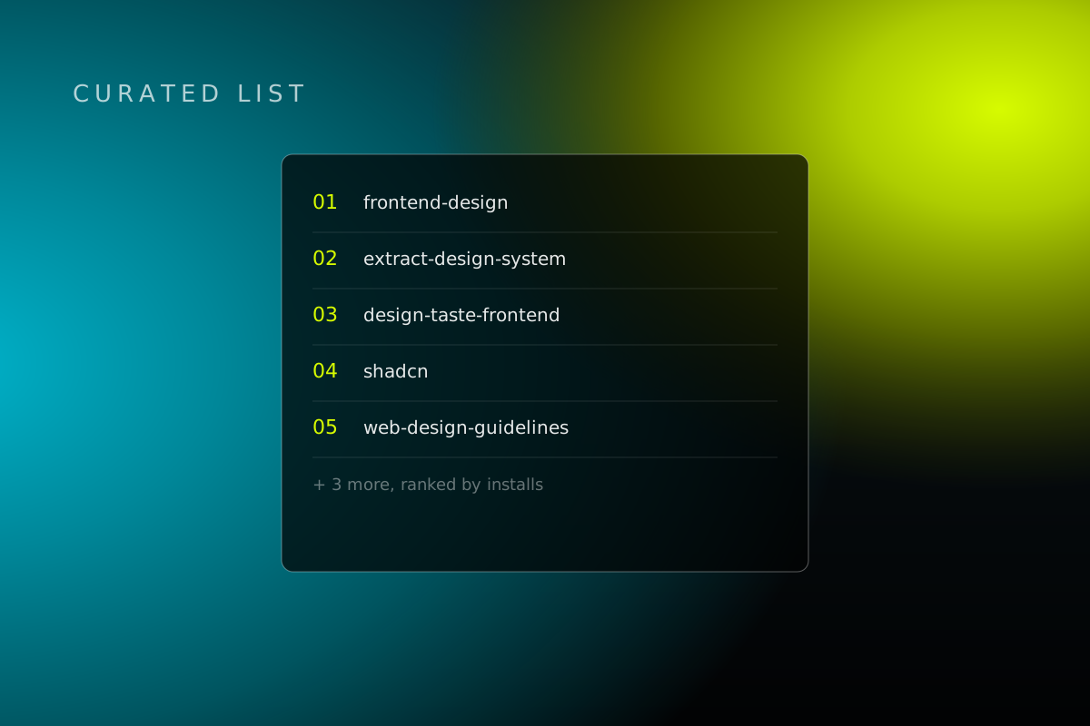
You know the failure mode already. The layout compiles. The components render. It still looks like every other AI-built site on the internet.
Frontend and UI is the single most represented use case in our entire skills catalog, ahead of testing, ahead of planning, ahead of every language-specific category combined. Not a coincidence. "Technically correct" is easy for a model. "Looks designed" is not, and nothing pushes it there unless something's steering.
We went through the full catalog and pulled out the eight that actually move the needle, in the order you'd reach for them on a real build. Every one of these is a plain SKILL.md folder, the open standard both tools read, so nothing here is locked to Claude Code specifically. Same skill, same folder, works in Cursor too.
1. frontend-design
anthropics/skills
Anthropic's own skill. Most installed design skill in the whole catalog, and there's a reason: it exists specifically to stop Claude from defaulting to the same templated look every AI coding tool produces the second you stop steering it. It opens by telling Claude to act like "the design lead at a small studio" whose client "has already rejected proposals that felt templated," then names the exact three looks it's sick of seeing: cream-and-terracotta serif pages, near-black with one acid-green accent, hairline-rule broadsheet layouts. Forces a documented color, type, and layout system before any code gets written, then a self-critique pass against that system before it ships. One skill, install this one first.
2. extract-design-system
arvindrk/extract-design-system
Most frontend work isn't greenfield. It's matching a brand that already exists. This points a headless browser at any public URL and pulls colors, fonts, and spacing into a starter tokens.css file, no manual squinting at a competitor's site required. It's upfront about the limit: "not a full component library," and it explicitly tells Claude not to treat the scrape as authoritative without a human actually looking at it. Faster than asking Claude to guess your brand from a paragraph of vibes, not a replacement for someone checking the output.
3. design-taste-frontend
leonxlnx/taste-skill
The raw system alone isn't enough. Someone still has to have an opinion. This injects one, because "technically correct" and "well designed" are not the same bar, and a model without taste will happily settle for the first. It runs on three numeric dials, variance, motion, and density, and opens every job with one mandatory line stating what it thinks it's building before touching code. It also bans a named list of defaults on sight: AI-purple gradients, the centered-hero-over-dark-mesh layout, three identical feature cards, Inter paired with slate-900, even specific fonts by name. And it has zero tolerance for em dashes, calling that the single most-violated rule in the whole file. We didn't use one writing this sentence either, for what it's worth.
4. shadcn
shadcn/ui
If you're building with shadcn/ui, and at this point most AI-assisted React projects are, this is the difference between Claude knowing shadcn exists and Claude using it the way your project actually expects. It runs npx shadcn@latest info --json and pastes your project's real config into context before touching a component, then enforces the mistakes Claude makes constantly on its own: gap-* instead of space-x-*, size-10 instead of separate width and height classes, semantic color tokens instead of manual dark-mode overrides, a Title on every dialog for accessibility. It even fixes the broken import paths that show up when Claude pulls a component from a third-party registry.
5. ui-ux-pro-max
nextlevelbuilder/ui-ux-pro-max-skill
Widens the palette. Literally. A local, searchable database of 79 style categories, 192 color and palette profiles, 74 font pairings, and 119 UX guidelines, queried through the same three-dial framework, variance, motion, density, that design-taste-frontend above uses independently. Apparently more than one person landed on that exact idea. The part worth knowing: it refuses to make things up. If a search comes back empty, it's explicitly instructed to say so and fall back to defaults rather than presenting a miss as a match.
6. web-design-guidelines
vercel-labs/agent-skills
Taste means nothing if the thing fails basic usability. This one runs as an audit, not a build-time nudge, triggered by phrases like "review my UI" or "check accessibility." The detail worth knowing: it doesn't ship a static checklist that goes stale. It re-fetches the actual guidelines doc from Vercel's own repo every time it runs, then grades your files against whatever that doc currently says, down to file-and-line callouts. Catches the stuff that's genuinely easy to miss: outline removed with no focus replacement, animations that ignore reduced-motion settings, hardcoded date formats instead of the browser's own locale tools. The step most "looks great" builds skip until a real user, or a compliance review, does it for you the hard way.
7. anti-ui-slop
uizze.com
The most on-the-nose skill on this list, because it's built on 800,000+ real app screens instead of taste rules someone wrote from memory. Worth knowing before you lean on it: that comparison is optional, gated behind a paid lookup the skill only reaches for when it genuinely can't resolve a visual question on its own, and it's told to fail silently rather than force a match if that lookup comes back empty. Its first instruction is also its most important one: read the existing brief, components, and constraints first, because they "always outrank this skill." It's a check against yesterday's AI look, not a replacement for knowing what you're building.
8. critique
pbakaus/impeccable
Every design needs a second pass before it ships, and this one is stricter about it than most. It runs two separate, isolated assessments, an LLM design-director-style review and a deterministic code scanner, and if it can't run them as separate sub-agents, it's required to print a literal "degraded" warning rather than fake a full pass. Findings get scored against Nielsen's 10 usability heuristics, tagged by severity, and checked against named personas like a first-time user or someone actively trying to break the thing, then handed off to a specific next command to fix what it found. Standing in for the objectivity you lost somewhere around hour six of staring at your own layout, with actual paperwork to back it up.
The actual workflow
Run these eight together and you've covered the real arc of a frontend build: pull in the real brand system, set a point of view, build with the right components, expand your options, validate against usability, benchmark against real interfaces, critique before shipping.
That's a different process than prompting Claude to "build a landing page" and hoping it doesn't look like everyone else's. It usually does, by the way. That's the whole point of this list.
This is one slice of a much bigger library. Testing, planning, security, everything else we track, ranked by live install counts, one command to install whatever fits your stack.
Want this run for your business?
Most partners start with The Growth Hour.